Overview
The Trip Report Summary sheet offers an overview of key trip metrics like frequency, pass rates, and conductor performance, aiding targeted improvements.
- Gain a comprehensive overview of trip activity across communities to guide improvement strategies.
- Understand the frequency of trip reports through the second bar chart.
- Identify correlations between trip pass percentages and overall trip volumes using the scatter plot.
- Assess the effectiveness of trip conductors by examining performance patterns in the Conducted by Summary table.
Layout Tips
- 1. Use the date picker in the top left corner to specify a date range for analysis.
- 2. Toggle the axis in the Trip Reports Closed By Community bar chart to view by trip conductor.
Questions to Get Started
What is the average number of closed trip reports last month, and which community has the highest number?
- Use the Date Picker to select Last Month and examine the Trip Reports Closed By Community bar chart to identify the community with the highest number of closed trips.
Which category has the highest number of closed trips, and what was the community pass percentage?
- Refer to the second bar chart and filter to the topmost value by selecting the bar. For corresponding pass percentages, cross-reference the data with the scatter plot titled Pass Percent vs. Count of Trip Reports, by Community
Trip Report PTC Dashboard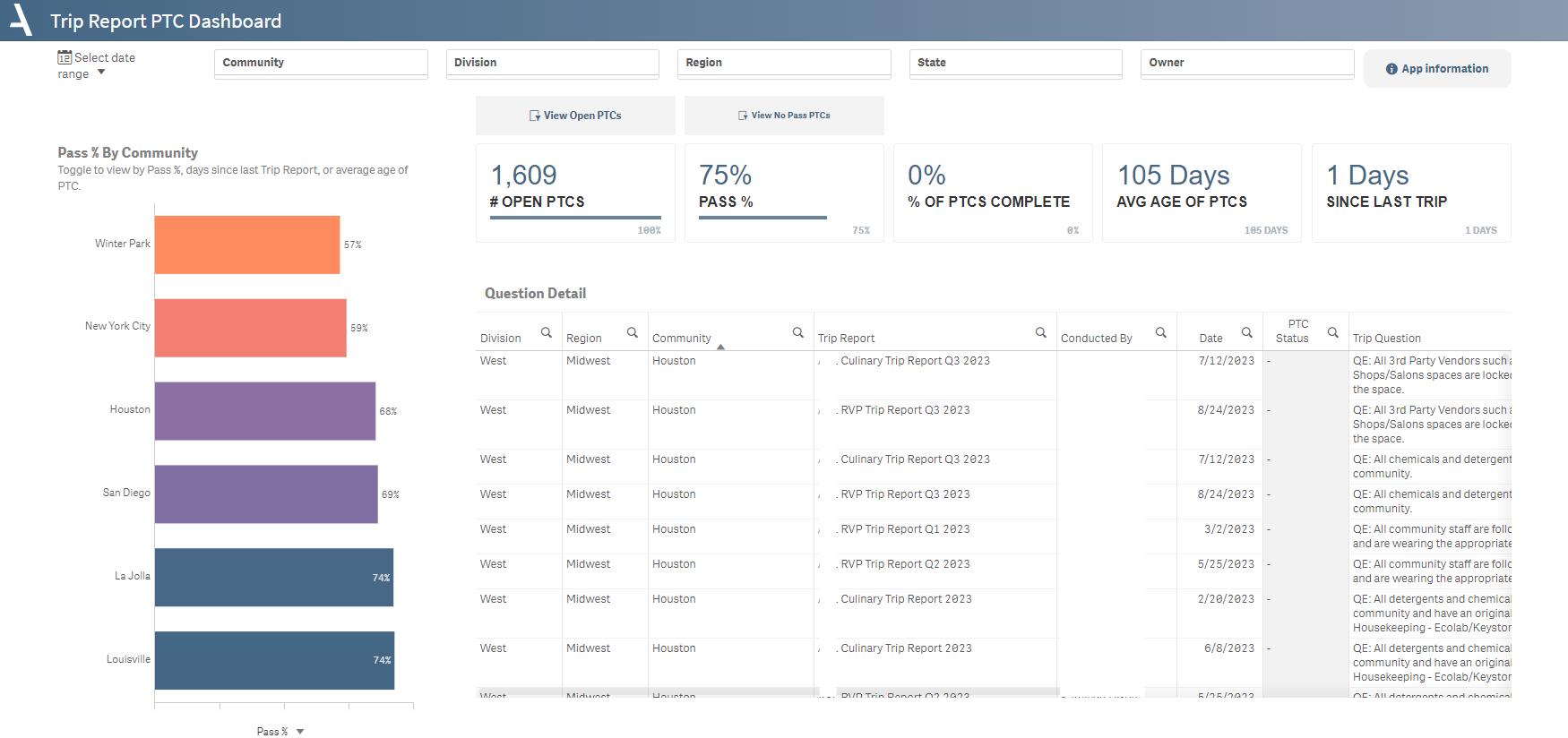
Track Plan to Correct (PTC) progress, assess pass percentages, and delve into detailed question-level data for informed decision-making.
- The KPIs at the top of the sheet instantly give you a snapshot of critical metrics like the number of open PTCs, overall pass percentage, and days since the last trip.
- Utilize the Average Open PTC Age metric to gauge the time-sensitive aspects of the Plans to Correct. This assists with prioritizing tasks and allocating resources efficiently.
- The Question Detail table allows for an in-depth examination of individual trip reports, providing you with actionable insights.
- The Pass % by Community bar chart helps identify high-performing and lagging communities.
Layout Tips
- Use the date picker in the top left corner to focus on data from specific periods. This is particularly useful when you want to examine trends or anomalies over time.
- The buttons above the KPIs allow you to filter specifically for Open PTCs and No Pass PTCs, sharpening your focus on these critical metrics.
- You can toggle the axis of the Pass % by Community bar chart to switch between viewing by Pass %, Days Since Last Trip, or Average Open PTC Age.
Questions to Get Started
What is the average age of open PTCs, and how does it vary across communities?
- Toggle the Trip Reports Closed By Community chart to view by Average Open PTC Age Review the corresponding KPI at the top to understand how each community contributes to the average.
Is my lowest performing community making progress on their PTCs? Are they up to date?
- Using the bar chart, toggle the axes to view by 'Pass %' and select the topmost community. Review the % PTCs Complete KPI, then browse the PTC Details table to view status and due date.
Was this article helpful?
That’s Great!
Thank you for your feedback
Sorry! We couldn't be helpful
Thank you for your feedback
Feedback sent
We appreciate your effort and will try to fix the article